More Than Just a Picture: The Psychology Behind Iconic Brand Logos
The FedEx logo has a hidden arrow in it — tucked between the 'E' and the 'x' — and once you see it, you cannot unsee it. That arrow is not an accident. It was placed there deliberately to suggest forward movement and precision, two qualities FedEx wants you to associate with every package they handle. That single design choice tells you almost everything you need to know about how seriously major brands think about their logos.
What a Logo Actually Does to Your Brain
Recognition Before Thought
A logo is processed by the brain faster than words. Research in visual cognition suggests that familiar symbols are recognized in milliseconds — well before conscious thought kicks in. That speed is the whole point. By the time you have read the word 'Coca-Cola,' your brain has already made an emotional association with the red-and-white script.
This is why rebranding is so risky. When a company changes a logo that millions of people have seen thousands of times, it is not just changing a picture — it is disrupting a deeply encoded mental shortcut. Gap's brief 2010 logo redesign lasted less than a week before public backlash forced the company to revert. The new design was not objectively bad. It was just unfamiliar, and unfamiliarity reads as wrong.
Psychologists call this the 'mere exposure effect': the more you see something, the more you tend to like it. Logos exploit this mechanism deliberately. The goal is not just to be seen once — it is to be seen so many times that recognition becomes comfort, and comfort becomes trust.
The Role of Implicit Memory
Most logo recognition happens through implicit memory — the kind that operates below conscious awareness. You do not decide to trust a brand; you just feel more comfortable with it. Advertisers have understood this intuitively for decades. The science caught up later.
How Color in Logos Shapes What You Feel
Color Is Not Decoration — It Is a Signal
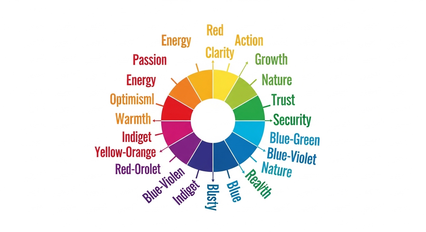
Color is probably the most studied element in logo psychology, and for good reason. Research consistently shows that color increases brand recognition significantly — some estimates put the boost at over 80 percent, though figures vary across studies. What matters is that color communicates before the shape does, and it communicates emotion.
Blue dominates the logos of banks, tech companies, and healthcare brands — think of the sheer number of financial institutions using some shade of navy or sky blue. Blue signals trustworthiness, stability, and calm. It is not a coincidence. Red, on the other hand, triggers urgency and appetite, which explains why so many fast food chains cluster around it. Yellow adds optimism and energy. Green carries associations with nature, health, and permission (it is, after all, the color of 'go').
Color reaches the emotional brain before the rational brain has a chance to weigh in — which is exactly why brand designers treat it as the most powerful tool in the kit.
The Counterintuitive Truth About Color Consistency
Here is something most people do not consider: the specific shade matters enormously. Tiffany & Co. has trademarked a particular robin's-egg blue — a color so associated with the brand that the box alone, without any logo, signals luxury. That level of color ownership takes decades to build, but once established, it functions as a logo in its own right. The box is the brand.
Color also interacts with cultural context in ways that can trip up global brands. White signals purity in many Western markets but is associated with mourning in several East Asian cultures. A logo that feels clean and modern in one market can carry unintended weight in another.
Why Logo Shapes Carry Hidden Meaning
Geometry Is Not Neutral
Circles suggest community, unity, and warmth. Sharp angles and triangles project strength, dynamism, and sometimes aggression. Horizontal lines feel stable; vertical lines feel aspirational. These are not arbitrary cultural rules — some of them appear to be rooted in how humans process visual information at a fairly fundamental level.
The Nike swoosh is a masterclass in shape psychology. It suggests motion, speed, and a kind of effortless arc — all without a single word. Phil Knight reportedly paid designer Carolyn Davidson just $35 for it in 1971. He did not even love it at first. Which sounds absurd now, given that it has become one of the most recognized symbols on earth.
Apple's logo — a bitten apple — works on multiple levels. The bite is a practical detail (it distinguishes the apple from a cherry at small sizes), but it also carries connotations of knowledge, temptation, and a certain irreverence. Whether all of that was intentional from the start is debated, but the associations accumulated over time and became part of the brand's identity.
Symmetry and the Feeling of Trustworthiness
Symmetrical logos tend to be perceived as more trustworthy and established. Asymmetrical ones feel more dynamic and creative. This is why law firms and financial institutions almost universally gravitate toward balanced, symmetrical marks, while advertising agencies and tech startups often lean into deliberate asymmetry.
A logo's geometry is a promise. Symmetry says 'we are reliable.' A sharp diagonal says 'we move fast.' Consumers read these signals without knowing they are reading anything at all.
How Logos Build Long-Term Brand Equity
The Compounding Effect of Consistency
A logo does not build meaning on its own. It accumulates meaning through consistent association with experiences, products, and stories over time. McDonald's golden arches meant nothing in 1953. Decades of consistent use — paired with specific smells, tastes, childhood memories, and advertising — loaded those arches with an enormous amount of psychological weight.
This is why brand consultants talk about 'brand equity' as a real financial asset. When Interbrand or similar firms value a brand, they are partly valuing the psychological infrastructure that a logo represents — the sum total of every association a consumer has ever made with that symbol. That infrastructure is genuinely hard to build and surprisingly easy to damage.
When Logos Evolve Without Losing Their Core
The most durable logos evolve gradually rather than abruptly. Shell's logo has been updated many times since the company was founded, but each iteration retained the basic scallop shell shape. Pepsi has refreshed its circular logo repeatedly while keeping the red, white, and blue color split. These incremental updates modernize the visual without breaking the encoded memory.
Contrast that with abrupt redesigns. When a company scraps a familiar logo entirely, it is essentially starting the equity-building process from scratch — which is an expensive and risky bet, even when the new design is objectively stronger.
(Opinion: The most underrated skill in brand design is restraint. The temptation to redesign everything when a company pivots is almost always a mistake. The logo is not the problem. The product is.)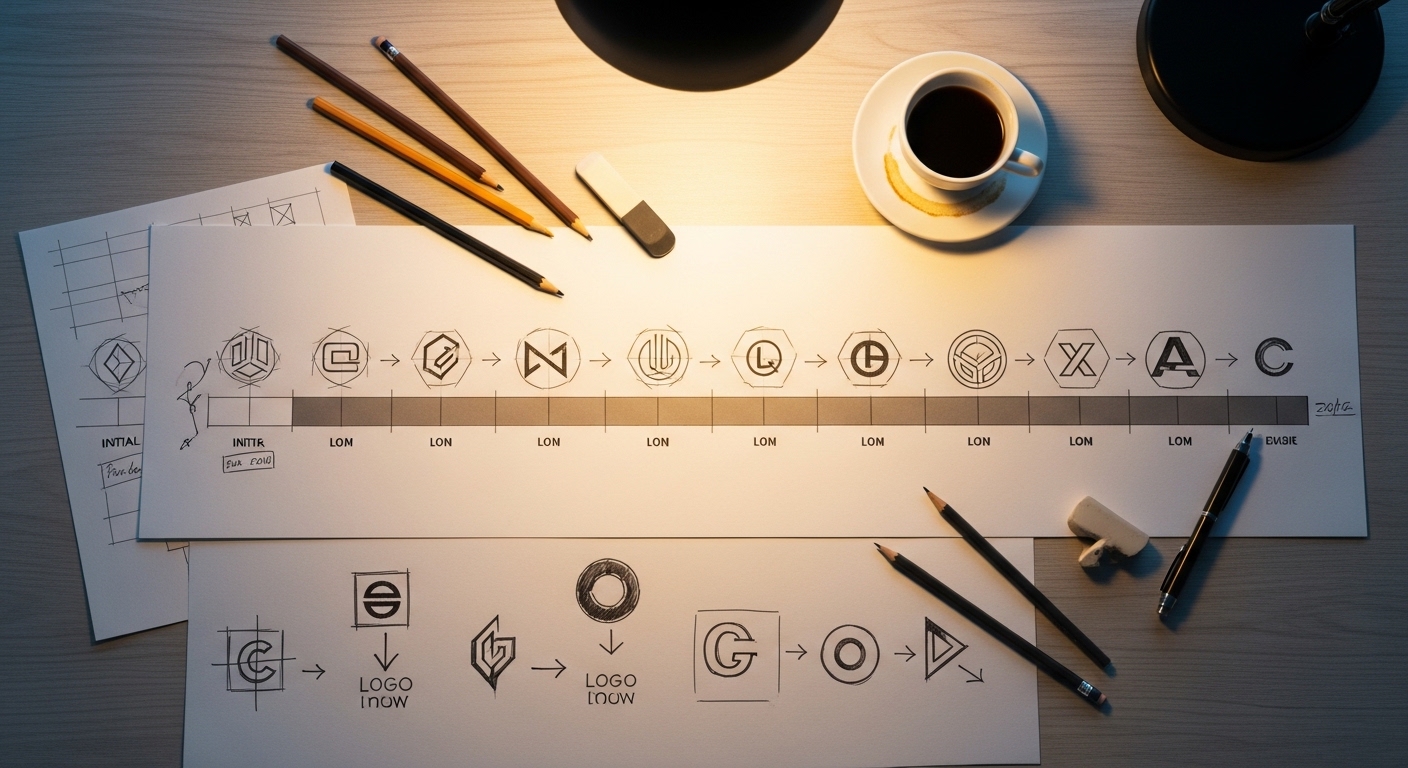
Frequently Asked Questions
Does the hidden arrow in the FedEx logo actually influence customers?
Most customers never consciously notice it, which is part of the point. Research on subliminal visual cues suggests that elements processed below conscious awareness can still influence perception and feeling. The arrow likely reinforces a sense of precision and forward momentum without the viewer ever registering why they feel that way.
Why do so many tech companies use simple, flat logos?
Flat design became dominant partly for practical reasons — logos need to scale cleanly across screens of every size, from a smartwatch face to a billboard. But the aesthetic also signals modernity, clarity, and confidence. A complex emblem can feel dated quickly; a clean geometric mark ages much more slowly. There is also a psychological dimension: simplicity reads as ease of use, which is exactly what tech companies want to promise.
Can a bad logo actually hurt a company's sales?
A weak or confusing logo rarely kills a company on its own, but it can create friction at every point of recognition. If a logo fails to communicate the right emotional signals — or worse, communicates the wrong ones — it undermines the brand's positioning in subtle, hard-to-measure ways. The bigger risk is a logo that is simply forgettable, because in a crowded market, invisibility is its own kind of damage.
The strangest thing about logo psychology is that it works best when it is invisible. The moment a consumer starts consciously analyzing why a logo makes them feel a certain way, the spell is partly broken. The most powerful brand symbols operate entirely below the threshold of scrutiny — which means the most effective design work is the kind nobody ever stops to notice at all.


Comments
Post a Comment