Flat Design vs. Skeuomorphism: How Digital Interfaces Evolved
Pick up almost any smartphone today and you're looking at the result of one of the most heated debates in design history. For decades, designers argued fiercely about whether digital interfaces should look like the real world — textured, shadowed, and tactile — or strip everything down to clean geometry and bold color. That argument gave us two distinct philosophies: skeuomorphism and flat design. And the winner? It's more complicated than you'd think.
| Option | Best For | Our Pick |
|---|---|---|
| Skeuomorphism | Onboarding new users, tactile familiarity, emotional warmth | ✓ For consumer apps targeting non-tech audiences |
| Flat Design | Speed, scalability, modern aesthetics, cross-device clarity | ✓ For most digital products in 2026 |
Skeuomorphism — Deep Dive 🎨
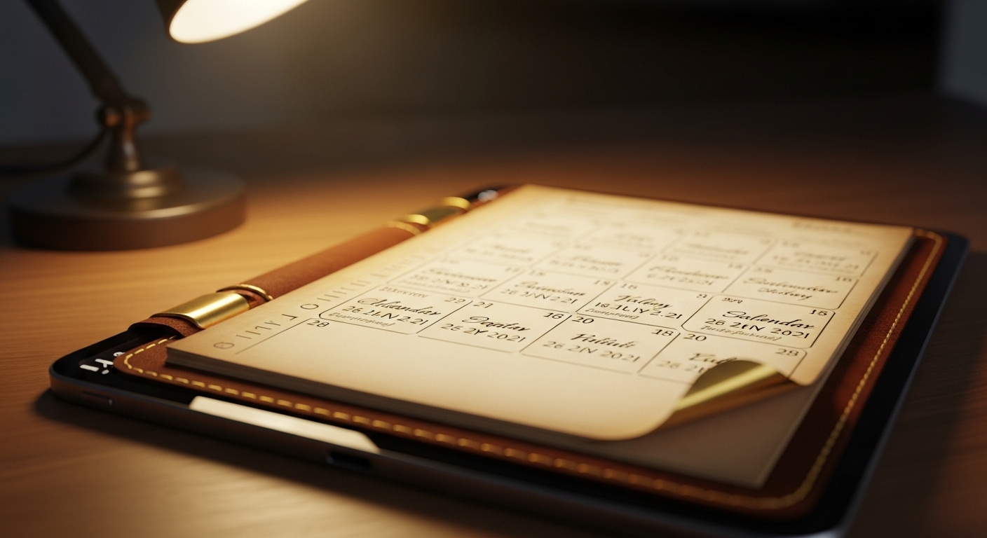
Skeuomorphism is the design practice of making digital elements look and behave like their real-world counterparts. A notes app that looks like a yellow legal pad. A calendar that mimics a leather-bound desk planner. A trash icon that actually looks like a metal bin. The word itself comes from the Greek skeuos (container or tool) and morphe (shape) — so it literally means "shaped like the tool it replaces."
Apple under Steve Jobs was arguably the most famous champion of this approach. iOS interfaces through the early 2010s featured woodgrain bookshelves in iBooks, green felt in Game Center, and stitched leather in the Contacts app. The logic was straightforward: if a digital button looks like a physical button — raised, shadowed, pressable — a first-time user instinctively knows to tap it. You didn't need a tutorial. The interface taught itself.
This wasn't just aesthetic vanity. Research in cognitive psychology suggests that humans process familiar visual metaphors faster than abstract ones, especially when encountering a new tool for the first time. Skeuomorphism was, in a real sense, a teaching tool disguised as decoration.
The counterintuitive surprise here: skeuomorphism actually predates digital design by centuries. Architects used it when they carved stone columns to look like bundled wooden logs — a holdover from earlier building techniques. Designers were borrowing a very old human habit.
A concrete real-world example: the original iPhone's Phone app used a glossy, rounded keypad that deliberately echoed the physical dial pads people already knew. For millions of users picking up a touchscreen device for the first time in 2007, that visual familiarity was a genuine comfort.
(Opinion: Skeuomorphism gets unfairly mocked today as kitsch, but it solved a real problem at a real moment in history. When billions of people were making their first contact with touchscreen computing, those leather textures and drop shadows weren't vanity — they were a bridge. Dismissing them entirely misses the point of what design is actually for.)
Flat Design — Deep Dive ⬜
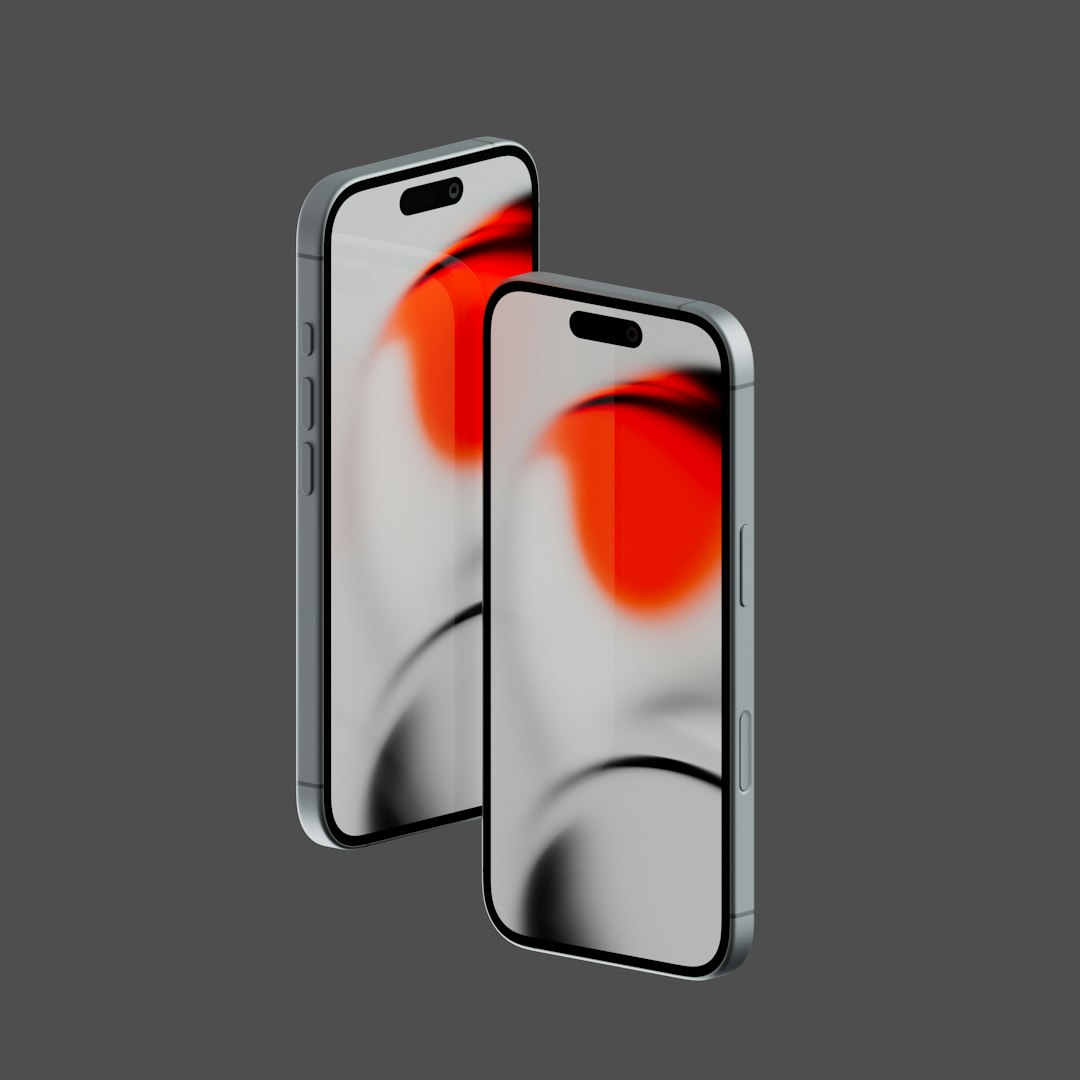
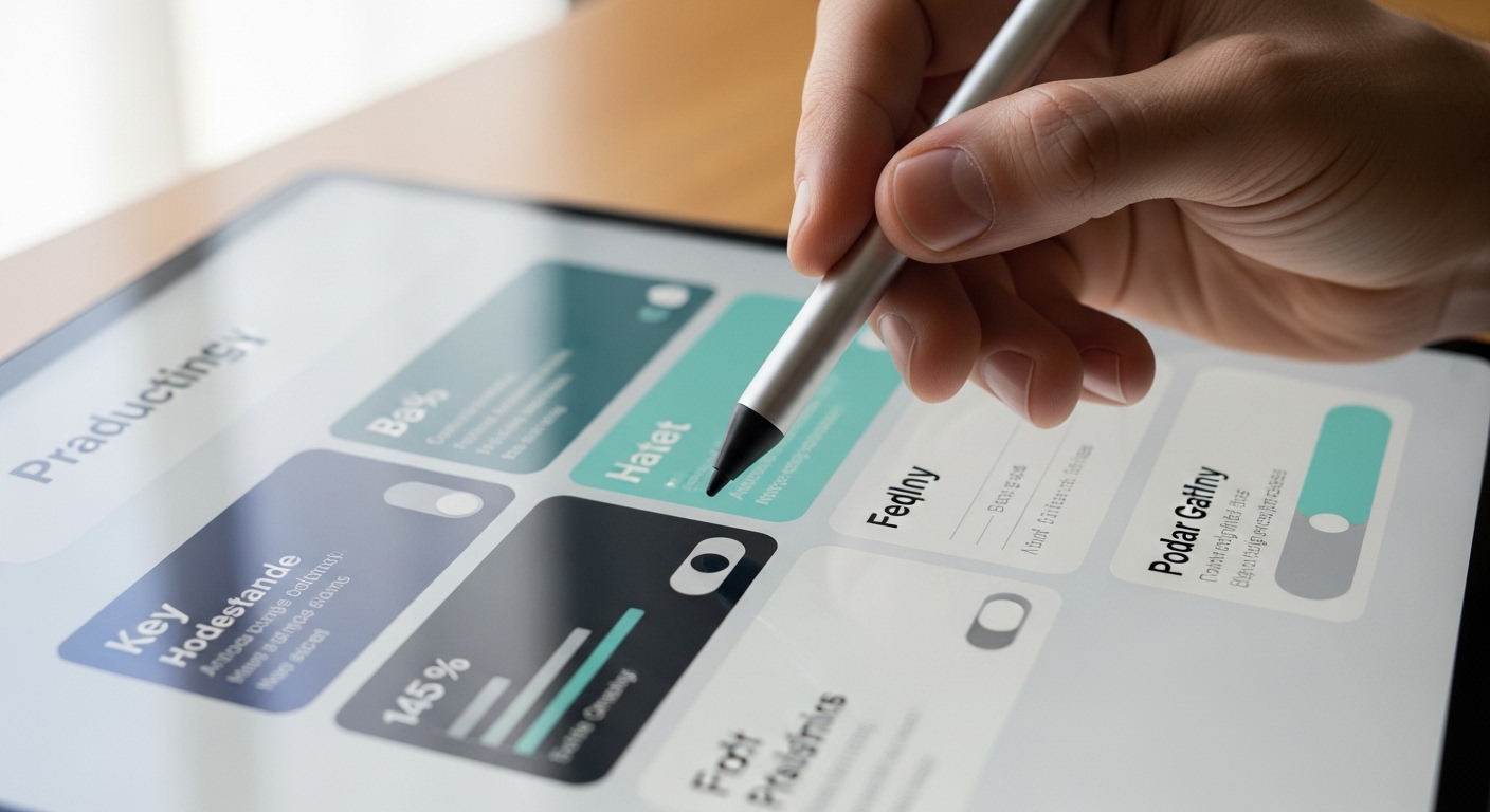
Flat design strips away every visual ornament that doesn't carry functional information. No gradients, no drop shadows, no textures, no beveled edges. What remains is pure geometry, typography, and color. An icon is a simple shape. A button is a colored rectangle. The interface makes no pretense of being anything other than what it is: pixels on a screen.
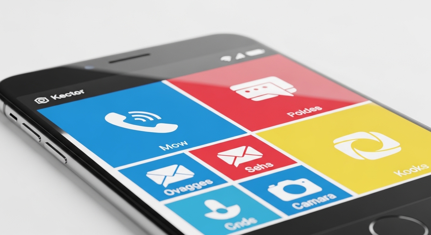
Microsoft was actually the first major tech company to commit to this philosophy at scale. Its Metro design language — introduced with Windows Phone 7 around 2010 and later expanded into Windows 8 — used bold typography, flat tiles, and vivid solid colors years before Apple's famous pivot. When Apple redesigned iOS 7 in 2013 under Jony Ive, flat design went mainstream almost overnight, and the industry followed.
The practical advantages are significant. Flat interfaces load faster because they require fewer graphical assets. They scale cleanly across screen sizes — from a smartwatch to a 4K monitor — without looking muddy or distorted. They're also easier to maintain and update, since a flat icon is just a vector shape rather than a multi-layered texture file.
There's a well-documented usability catch, though. Early flat design implementations suffered from what designers call "flat design blindness" — users couldn't tell which elements were interactive and which were just decorative, because everything looked equally two-dimensional. This pushed the industry toward what's now called "semi-flat" or "flat 2.0" design, which reintroduces subtle shadows and depth cues without going full skeuomorphic. Google's Material Design system, launched in 2014, is the clearest example of this middle path.
A real-world example: when Apple's App Store shifted to flat icon guidelines, developers had to redesign thousands of app icons. The transition was jarring enough that some users genuinely complained about losing the "warmth" of the old interface — a reaction that tells you something important about how emotionally invested people get in visual design.
Head-to-Head Feature Comparison 📊
| Feature | Skeuomorphism | Flat Design |
|---|---|---|
| Visual complexity | High — textures, shadows, gradients | Low — shapes, color, typography only |
| Learning curve for new users | Low — familiar real-world metaphors | Medium — requires some digital literacy |
| Performance impact | Higher — heavier graphical assets | Lower — lightweight vector assets |
| Scalability across devices | Poor — textures degrade at different sizes | Excellent — vectors scale perfectly |
| Emotional warmth | High — tactile, familiar, nostalgic | Lower — clean but can feel cold |
| Discoverability of interactive elements | High — buttons look pressable | Variable — depends on implementation |
| Design maintenance effort | High — complex layered assets | Low — simple, modular components |
| Current industry adoption | Niche — mostly retro or specialized apps | Dominant — industry standard in 2026 |
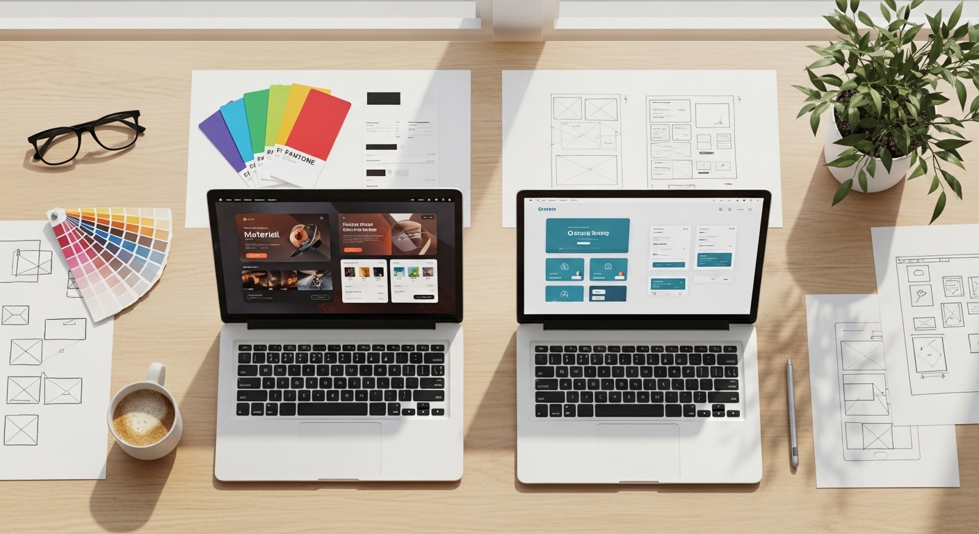
Looking at these two philosophies side by side makes the trade-offs immediately visible — and explains why the real world landed somewhere between the two extremes.
Which Should You Choose? 🤔
The honest answer in 2026 is that almost no serious product uses pure skeuomorphism or pure flat design. The industry has converged on hybrid approaches — but understanding which direction to lean still matters enormously depending on your context.
Choose skeuomorphic elements when:
- Your audience includes people with limited digital experience — older adults, users in markets where smartphone adoption is still relatively recent, or children encountering interfaces for the first time.
- You're building a creative or lifestyle app where emotional warmth and tactile feel are part of the product's value — think music apps, journaling tools, or games.
- You want users to immediately understand an unfamiliar interaction without reading instructions.
- Your brand identity leans deliberately retro or artisanal.
Choose flat design when:
- You're building for a digitally literate audience that values speed and clarity over hand-holding.
- Your product needs to work across a wide range of screen sizes and resolutions.
- You're working in a fast-moving product environment where design assets need to be updated frequently.
- You're building enterprise software, productivity tools, or data-heavy dashboards where visual noise is the enemy.
The most pragmatic framework: start flat, then add depth only where users demonstrably need it. Google's Material Design and Apple's current Human Interface Guidelines both follow this logic — they're flat by default, with carefully rationed shadows and elevation cues added only to signal hierarchy and interactivity. That's not a compromise. That's the lesson the industry learned the hard way over roughly fifteen years of experimentation.
A concrete example: banking apps almost universally use flat or semi-flat design today, because their users are digitally comfortable and the priority is information clarity. But a children's educational app might still use chunky, textured buttons that look satisfyingly pressable — because the audience genuinely benefits from those physical metaphors.
Frequently Asked Questions
Is skeuomorphism completely dead in 2026?
Not entirely. Pure skeuomorphism is rare in mainstream apps, but skeuomorphic elements survive in specific niches — children's apps, music production software, games, and some lifestyle apps deliberately use textures and real-world metaphors for emotional effect. The broader industry has moved to semi-flat design, which borrows selectively from both philosophies.
What is "neumorphism" and how does it fit in?
Neumorphism (sometimes called "new skeuomorphism") emerged as a design trend around 2020, combining flat color palettes with subtle extruded shadows to create a soft, plastic-looking 3D effect. It generated significant buzz but faced serious accessibility criticism — the low contrast between elements made interfaces difficult to read for users with visual impairments. It remains a niche aesthetic rather than a mainstream approach.
Which design style is better for accessibility?
Neither is inherently more accessible — execution matters more than philosophy. Flat design can fail accessibility when interactive elements lack sufficient visual contrast. Skeuomorphism can fail when textures create visual clutter that overwhelms users with cognitive differences. The key is ensuring adequate color contrast, clear interactive affordances, and consistent visual hierarchy regardless of which style you're working in.
The flat vs. skeuomorphism debate didn't end with a winner — it ended with a synthesis. The interfaces you use every day in 2026 are the product of that long argument: clean enough to be fast and scalable, but with just enough depth and shadow to tell you what to tap. That's not a draw. That's design doing exactly what it's supposed to do — solving problems so quietly that you never notice it working.


Comments
Post a Comment